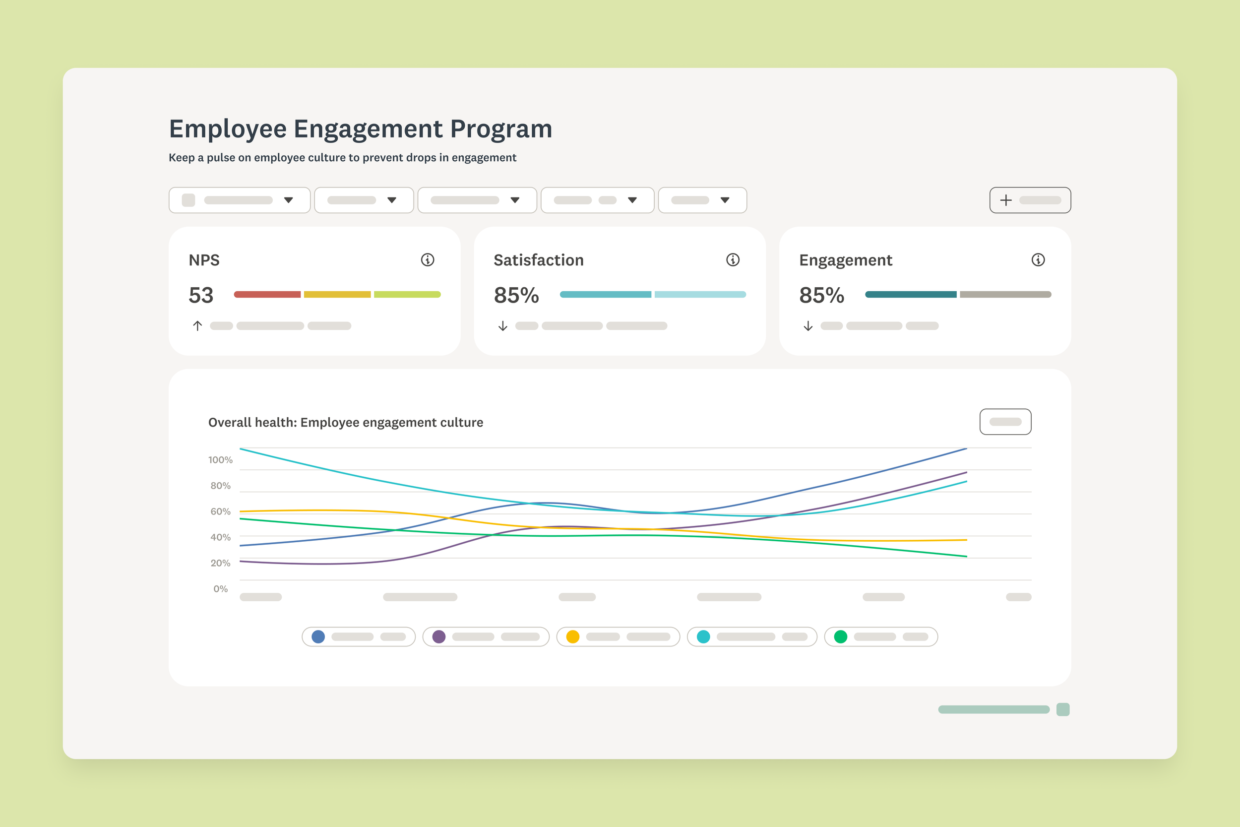
Feedback programs
From isolated surveys to a continuous listening platform
Lead Product Designer, Senior Product Designer, Content Designer, 1 User Researcher, 2 Product Managers,4 Engineering Man agers, 1 Architect, and 5 Engineering teams
TEAM
MY CONTRIBUTION AS DESIGN LEAD
I led end-to-end UX/UI design from early concept definition through launch. This was a 0-to-1 project that started with a vague directive. I shaped what Programs became before requirements existed, running workshops to define scope, translating ambiguous ideas into early concepts, and socializing them upward to build alignment.
LAUNCH DATE
April 2026
PROBLEM
Isolated surveys provided limited insights
66% of users who deployed a survey never came back for a second one
Most of our users collected episodic feedback. One-off surveys captured a moment in time, but teams couldn't see what was changing, didn't know when to resurvey, and had no way to connect results over time. Insights expired before anyone acted on them.
Setting up survey recurrence and combined data analysis made the problem worse. The paths to both were hidden and cumbersome, so even users who wanted continuous feedback mostly gave up or worked around our tool entirely.
RESEARCH & DATA
Users were already doing this work, just not in our tool
The value of programmatic feedback collection wasn't a hard sell. Users already combined data across surveys and ran recurring research cycles. They weren't doing it with us.
7/10
participants praised the value of programs
10/10
participants combined data across surveys
User interviews. The program’s value proposition resonated strongly. Participants were already running informal versions of this workflow outside the product.
GOAL
Empower users to conduct programmatic research
Programs should help users continuously collect feedback, identify trends, and uncover insights to take timely action. Moreover, users should be able to set up recurring surveys and workflows once, then let them run.
How would we know it was working
Program adoption and program user retention compared to non-users were our north star metrics. This was a net-new feature with no baseline, so early signals would define the direction for future quarters.
DEFINITION
Shaping the product before requirements existed
The directive I started with was intentionally loose: connect related surveys, encourage repeat usage, and surface data across them. There were no requirements, no defined scope, no existing mental model to build on.
I ran workshops with designers and content designers to explore what "connecting surveys" could mean for users.
From those workshops, I translated the ideas into early concepts and socialized them with stakeholders and leadership to build alignment before any formal requirements were written. The decision to offer both pre-built and custom programs came from leadership, but the framework for how those two paths would work together and where they'd intersect was defined through this process.
LEADERSHIP & VISION
Driving a high-stakes project from 0-1
Frequent alignment with leadership
I led regular checkpoints with the VP of Product and other executives to build confidence in the design direction early. I committed to applying feedback immediately to keep momentum.
Using AI to move faster
I used AI tools including Lovable, Claude, and ChatGPT to accelerate design explorations, evaluate concepts, synthesize research findings, and create interactive prototypes for usability testing. This compressed the time between idea and feedback, which mattered greatly on a project this size.
Setting expectations around change
I set explicit expectations with engineering that designs would evolve. If research surfaced something new or technical constraints shifted, we would pivot together. That openness meant engineers trusted the changes rather than resisting them.
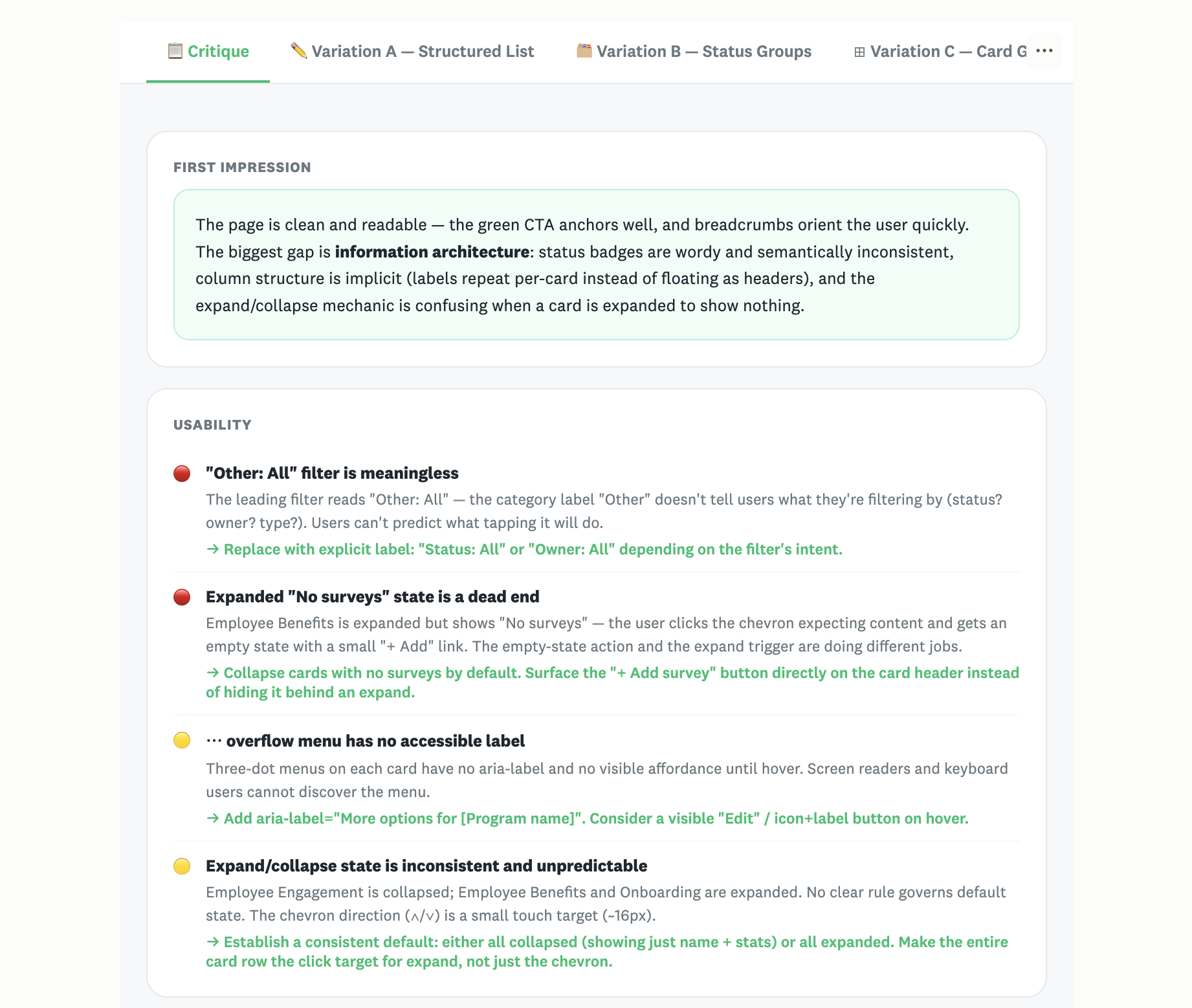
AI tools. Using Claude to critique designs and generate alternatives (top) and Lovable to create an interactive prototype for user testing (bottom)
DESIGN
Helping new users experience the value of programs quickly
Early concepts focused on presenting programs tailored to users' goals. These pre-built programs could be added in a few clicks and included a set of connected surveys, a recommended cadence, and a preconfigured dashboard to track trends over time.
After setting up their first program, users could add other pre-built programs or create their own.
Conceptualization. A low fidelity flow helped support stakeholder alignment.
Connecting existing functionality with new UI elements
The first iteration used existing scheduling and data visualization infrastructure as the foundation. The design work focused on the connective tissue — the UI elements that made those existing pieces feel like a coherent system rather than disconnected tools.
Introducing programs to new users
The Made for You page became the default landing page after signup. It surfaced three recommended programs based on the user's profile, with the top recommendation expanded by default.
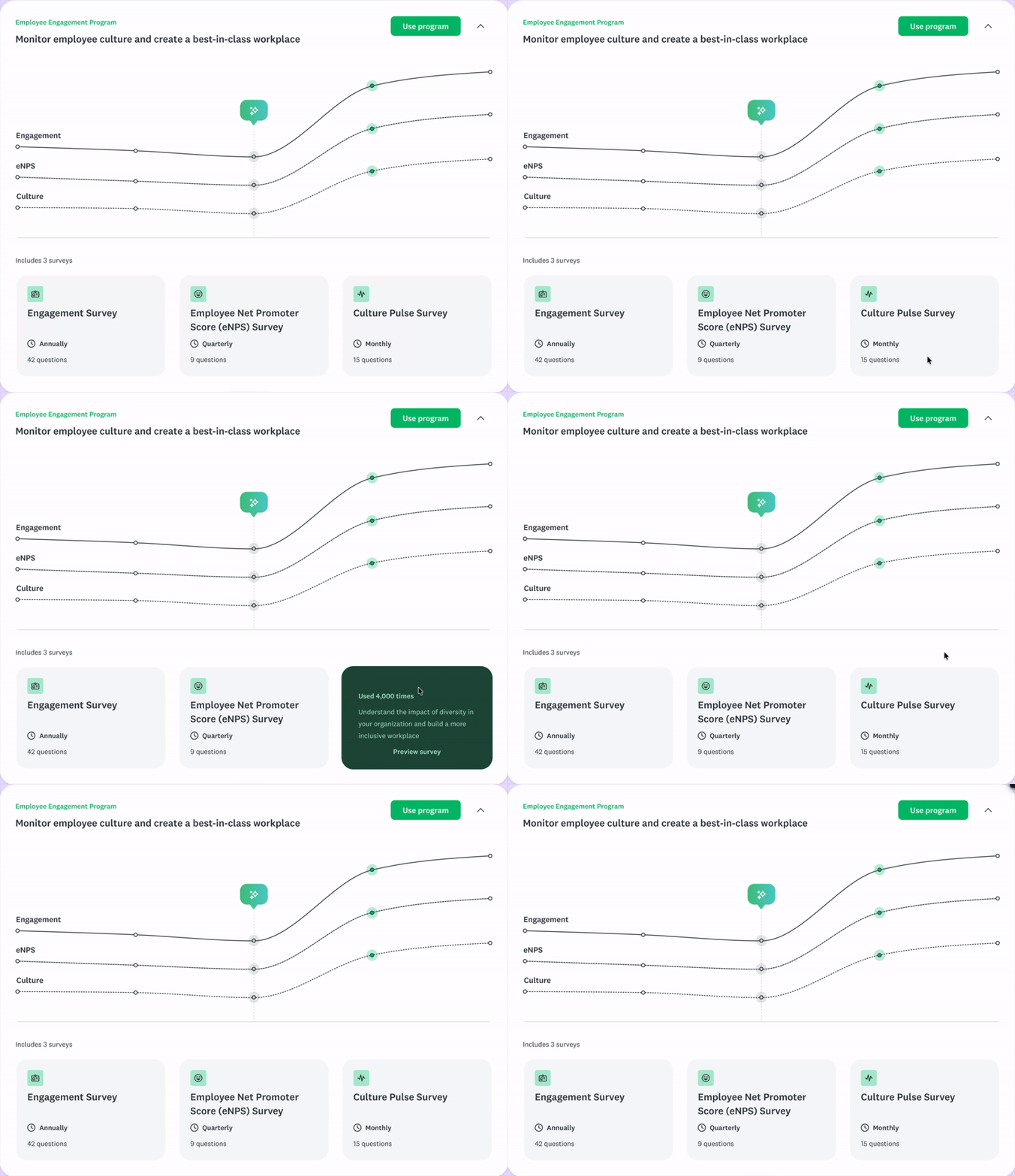
Main recommendation. Users could learn more about the surveys included by interacting with the cards
Guiding the program setup experience
The Program Overview became the home for each program, the place where users managed surveys and tracked insights as responses came in. Recommended cadences were surfaced in the survey list, and scheduled surveys were flagged with an icon so users could see their setup at a glance.


Surveys list. The recommended cadence was presented in the survey list (Top). A checkmark indicator signaled surveys already scheduled (Bottom).
Creating custom programs
Users could also build their own programs from scratch by naming them, adding surveys or creating new ones, and configuring visualizations. Critically, I designed two entry points for adding surveys to a custom program — from within the program itself and from the All Surveys list. This came from a systems instinct that users would arrive at the same action from different places depending on where they were in their workflow, and both paths needed to work.
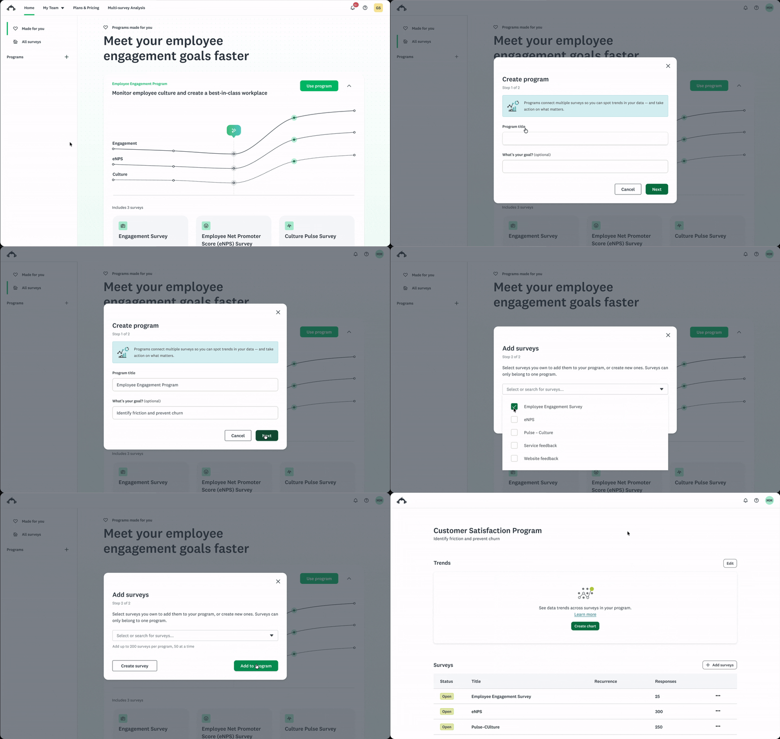
Creating custom programs. Custom program setup required
Made for you page. Introduced the concept of programs to new users and included 3 recommended pre-built programs.
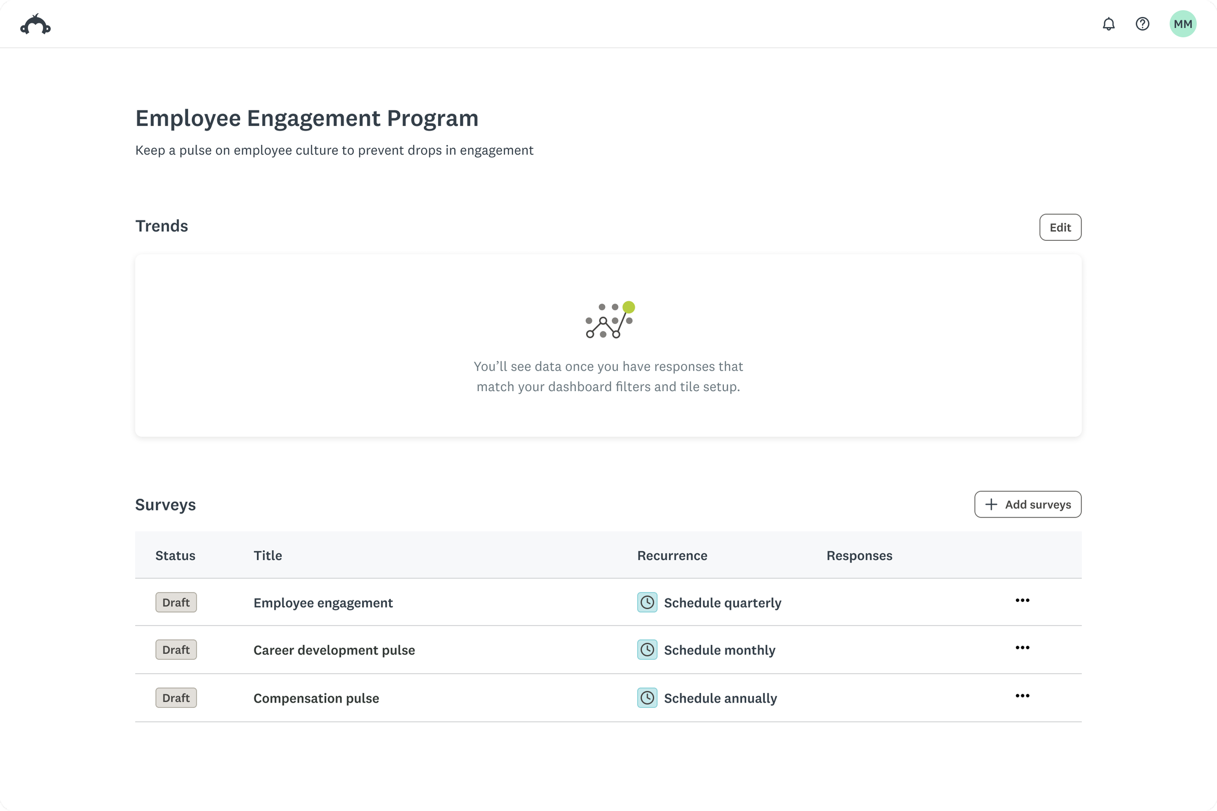
Program overview page. “Home” of programs, allowed users to manage their surveys and visualize insights.
USER TESTING
Observing users creating programs
Round 1 – pre-built programs
Method
10 participants, unmoderated
Task
Create an Employee Engagement Program and schedule it quarterly
Before testing began, I flagged that the scheduling carried real usability risk. The test confirmed it.
4 of 10 participants assumed they were creating a single survey instead of a program
4 of 8 users completed recurrence setup Scheduling was the single biggest completion barrier
7 of 8 users copied the survey link before configuring recurrence
Round 2
Method
10 participants, unmoderated
Task
Combine four CSAT surveys into a program with a 6-month trend view
Before testing began, I flagged that the visualization creation also carried real usability risk.
10 of 10 users started a custom program from surveys selection
Users thought surveys-first, not programs-first
Most participants attempted to pick all questions rather than only the key ones. They mistook the step for filtering.
The tile type selection step created unnecessary friction: users guessed arbitrarily and tried to select multiple tiles because they didn't understand what they were choosing.
These findings validated the risk I'd raised. The team made a deliberate decision: ship and learn rather than delay for a more polished flow. Getting Programs into users' hands quickly would teach us more than waiting. Scheduling and visualization became top priorities for the quarters that followed.
ITERATION AND DELIVERY
What the research drove next
Messaging and onboarding
The mental model confusion in Round 1 triggered a full review of the communication strategy from marketing to UX copy, onboarding flows, and Help Center content.
Rethinking the hardest flows
Scheduling and visualization creation, the risks I'd flagged before launch, became the primary design focus for the following quarters. The usability data gave us the specificity to prioritize and scope that work.
Connecting the dots: an agentic vision
In parallel, I initiated an exploration that connected three distinct internal workstreams (agentic survey creation, Programs, and agentic analysis) into a single cohesive vision. The idea was to have one agent supporting users across the entire feedback lifecycle, from creating and scheduling surveys to interpreting responses to surfacing recommended actions. This wasn't a directed project. It came from recognizing that these workstreams were solving adjacent problems in isolation and that the real opportunity lay at the intersection.
IMPACT
High retention and steady adoption
Program users are significantly more likely to stay on the platform than non-users. A ~20-percentage-point retention gap held consistently across every month post-launch — April through July.
7x
QoQ adoption growth
Custom programs dominated — and that changed our priorities
94% of programs created were custom, up from 80% in May. We hadn't expected this. It told us that pre-built programs weren't yet meeting users' specific needs, or that their value hadn't been communicated well enough. Either way, it shifted our focus toward improving the custom program flows, particularly visualization creation.
94%
programs created were custom, up from 80% in May
89%-94%
Programs user retention vs 68–71% for non-Programs users
Key to success
Ship the bet, then prove it right
I flagged the scheduling and visualization risks before launch. Testing confirmed them. We shipped anyway — deliberately — because early adoption data would tell us more than a delayed perfect version. That decision proved right: Programs found their users faster than expected, and the data gave us the specificity to improve the right things.
Change as a shared operating principle
The pace of this project meant designs evolved while engineering was building. I set explicit expectations upfront that this would happen and framed changes as improvements we would navigate together rather than problems to absorb. That built the trust that kept the team moving.
Feedback
-
Just wanted to say that I love the work you've done with Programs. It's a large project with so many unknowns and I'm amazed at how you've been funnelling so much feedback in your designs.
Talha Ahmad
(Senior Engineer Manager) -
I really admire your ability to take complex information and distill it into simpler, more approachable experiences. That clarity has been incredibly helpful as we continue to evolve spaces within Programs.
Sneha Nemali
(Senior Product Designer)