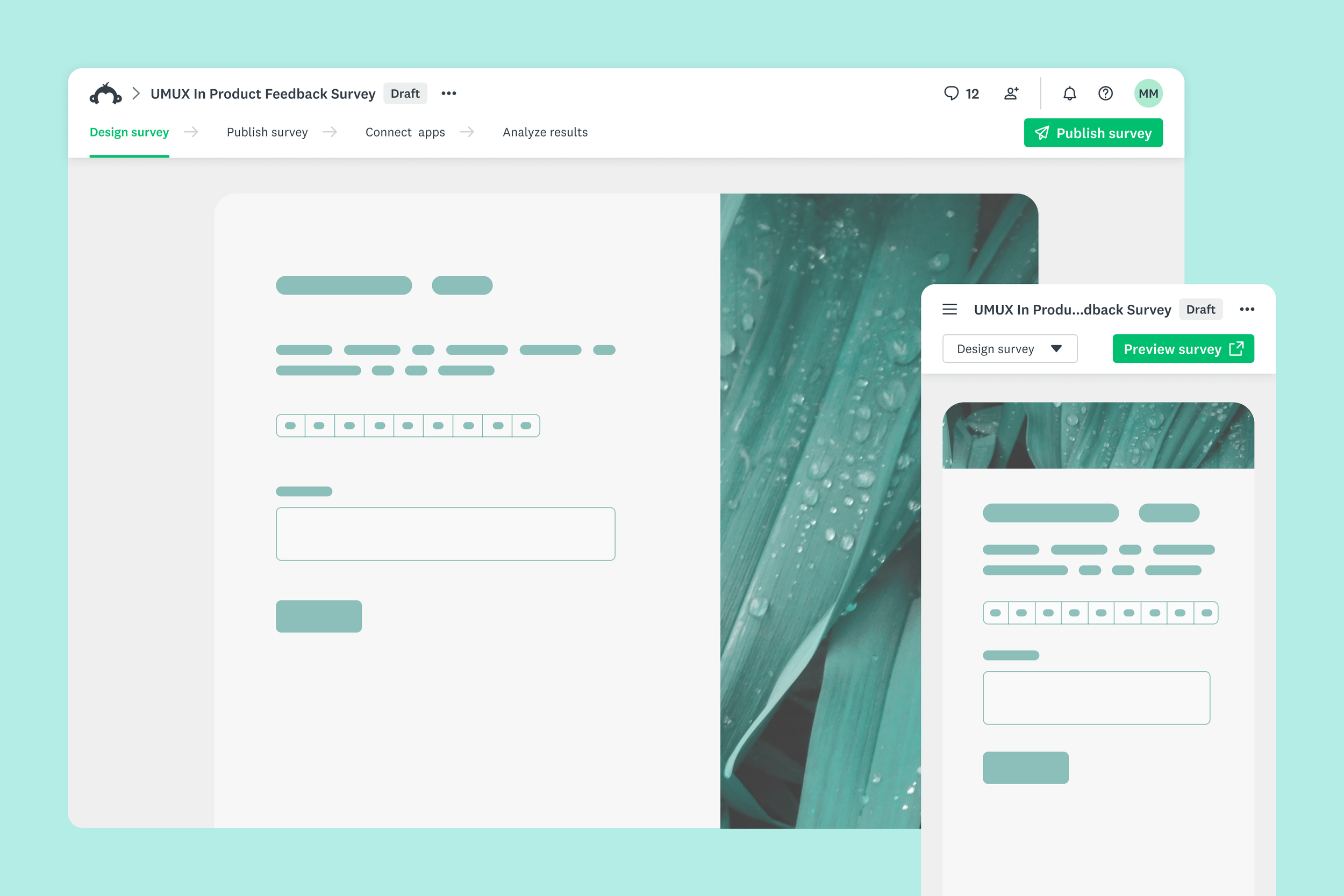
Improved survey navigation
Simplifying the header to support the survey creation task
TEAM
Lead Product Designer, Product Manager, Engineering Manager, Lead Content Designer, and 2 front-end Engineers
MY CONTRIBUTION AS DESIGN LEAD
LAUNCH DATE
Translate research insights into conceptual designs
Drive alignment between teams
Create high-fidelity specs and support implementation
January 2026
PROBLEM
Inefficient navigation hindered the survey creation journey
From 25% of users who initiated a survey,
only 9% launched it
The account header, the most prominent element on the UI, was displayed on every product screen, even when it was not relevant to the ongoing task.
a. Unclear hierarchy
The most prominent element on the screen displayed options that navigated users outside of the survey they were working on.
b. Poor wayfinding
The tabbing system was supposed to help users orient themselves. However, no tab was selected when users were within a survey, which did not help wayfinding at all.
c. Button clutter
The multiple buttons on the top right of the screen confused users, who struggled to identify what step to take next.
RESEARCH
Users value aesthetic appeal and efficient distribution
A co-design exercise revealed that users wanted both the surveys they create and their survey platform to be “modern” and visually appealing. Regarding the interface, they expected it to display what is relevant and obscure what is not. “Grabbing a link”, for example, should be faster and easier.
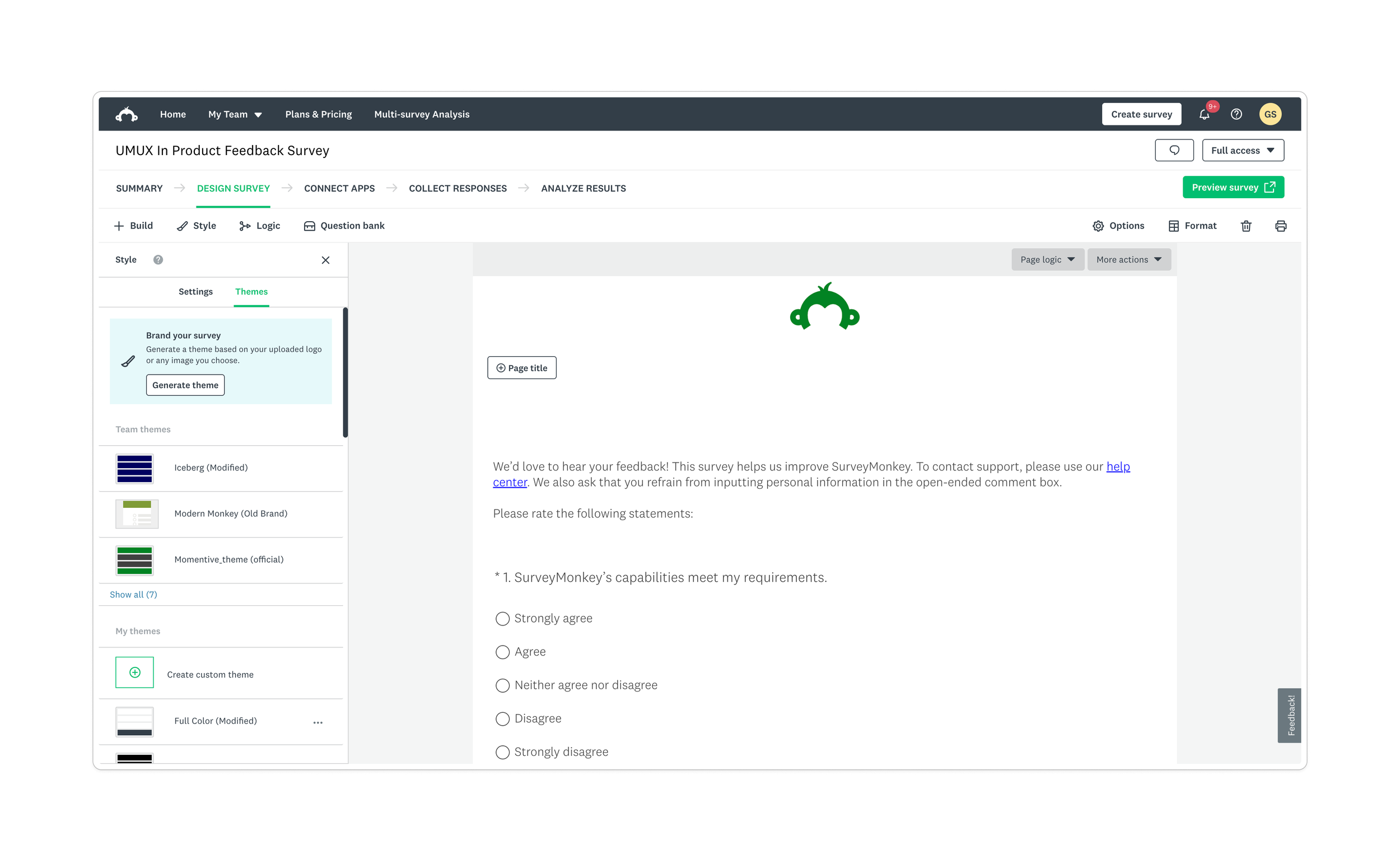
The app header was visually heavy and distracting, removing attention from survey creation and analysis tasks. The number of buttons on the top right confused users, who wouldn’t know what step to take next.
Method
Participants: 10 survey creators
Task: Design their ideal survey platform
Goal: Understand users’ survey process mental model and priorities during survey creation and launch
Previous research reiterated these findings. The card sorting research had already revealed that launching the survey was a pivotal moment in the user flow. The steps before and after launch were more recursive and less linear.
A visual language study helped clarify users’ definition of “modern”. Participants tended to consider more modern applications with minimalist UIs and highly Interactive components. Participants preferred UIs where only the elements essential to the user journey were visible. These elements would change, adjust to the context, to provide users with the resources needed for them to complete their tasks
User feedback
“Just give me the button, and 5 things I have to click.”
“I like having options, but I’ve got a clutter of options I rarely use.”
GOAL
Simplify the survey navigation to help users launch their surveys
Insights from research helped delineate the following general goals for the project:
Modernize the visual presentation
Update the dense and cluttered UI elements to align with the brand and support the user’s focus instead of competing with it
Revisit the hierarchy and information architecture
Emphasize primary actions and progressively disclose complexity to balance depth and breadthImprove wayfinding
Provide consistent signposts to orient the user, making it fast and easy to take action
Success indicators
An improved navigation should reduce the gap between survey initiation and launch.
Increase survey deploys
Reduce drop-off during the survey creation flows
LEADERSHIP
Working across teams
The header component was a foundational UI element, present in all steps in the survey creation journey. That meant this change would impact most product teams. Previous attempts to make small adjustments to the navigation had taken a really long time and yielded underwhelming results.
As the design lead, I relied on the following strategies to ensure the project’s impact and fast delivery:
a. Defining clear principles and problems to solve
To get teams on board with the proposals, the design explorations focused on clear principles and specific problems to solve. The concepts of radical simplification and balance guided the ideation and anchored the design decisions.
b. Committing to an ambitious schedule
The allocated resources for this project allowed for 1 quarter of development. That required a very fast design process, from conceptualization to high-fidelity. Excited about delivering high impact, all team members are committed to a tight schedule and a very agile process. Proofs of concept and test plans were created in parallel with the designs.
c. Opening multiple channels of communication
Regular syncs and open Slack channels allowed the team to communicate challenges early and work together to find solutions. The communication involved also external teams, who were stakeholders in the process. Meetings with these teams allowed us to listen to their concerns and improve the designs based on their deep knowledge of the workflows.
Principles
Radical simplification
Help users focus on their jobs-to-be-done by removing distractions and simplifying navigation UI and IA. Adopt a clear, consistent hierarchy and lean on user context to make primary actions obvious and increase speed to deploy.
Balance
Consider users’ conflicting desires of having a simple, easy to use UI while having access deep and powerful product functionality. Leverage dynamic interaction frameworks (i.g.: modes, progressive disclosure) to balance this tension.
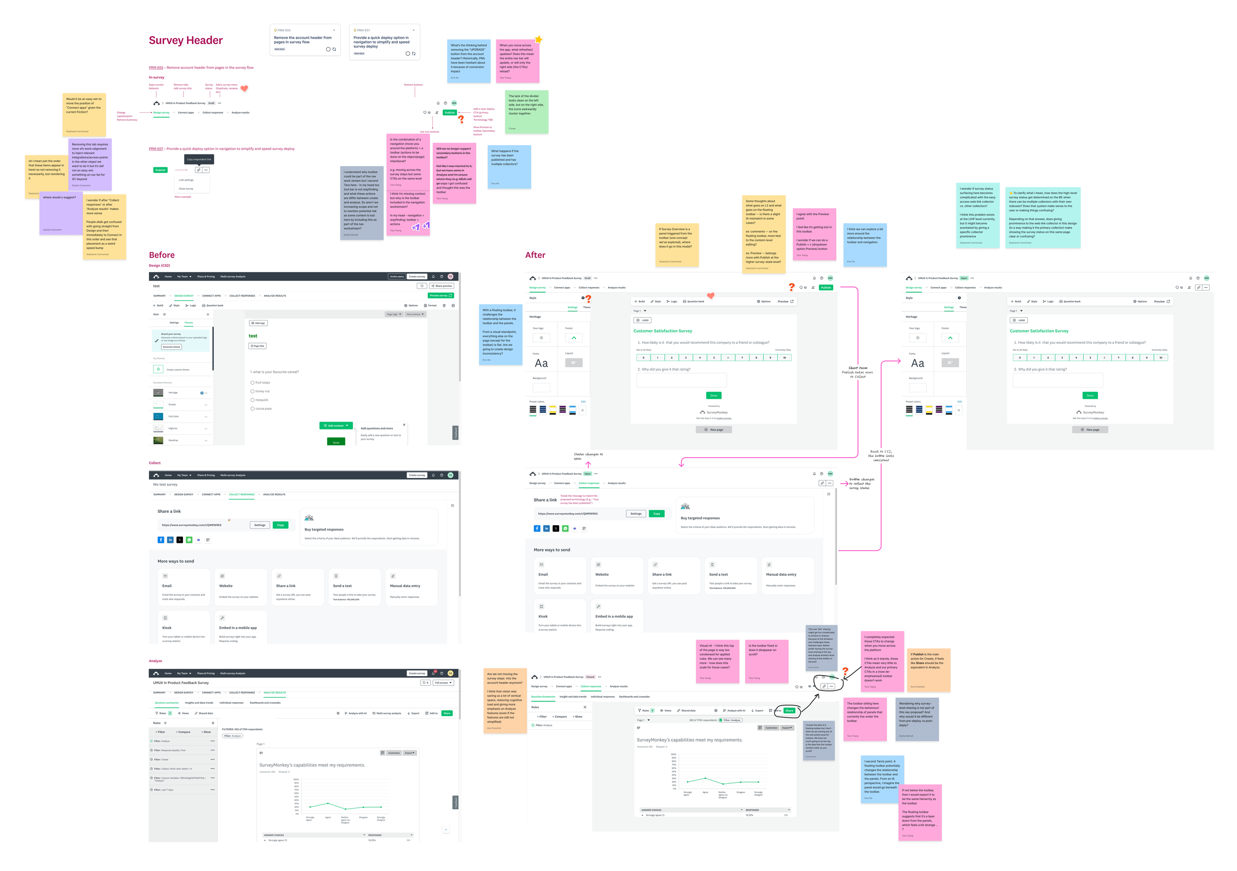
Jam session with designers. Designers from multiple teams provided feedback that was considered in the next iterations.
DESIGN
The concepts focused on simplification, streamlining, and balance
The design phase kicked off with ideation on the learnings from the co-design exercise and product usage data. Low-fidelity wireframes communicated the ideas generated.
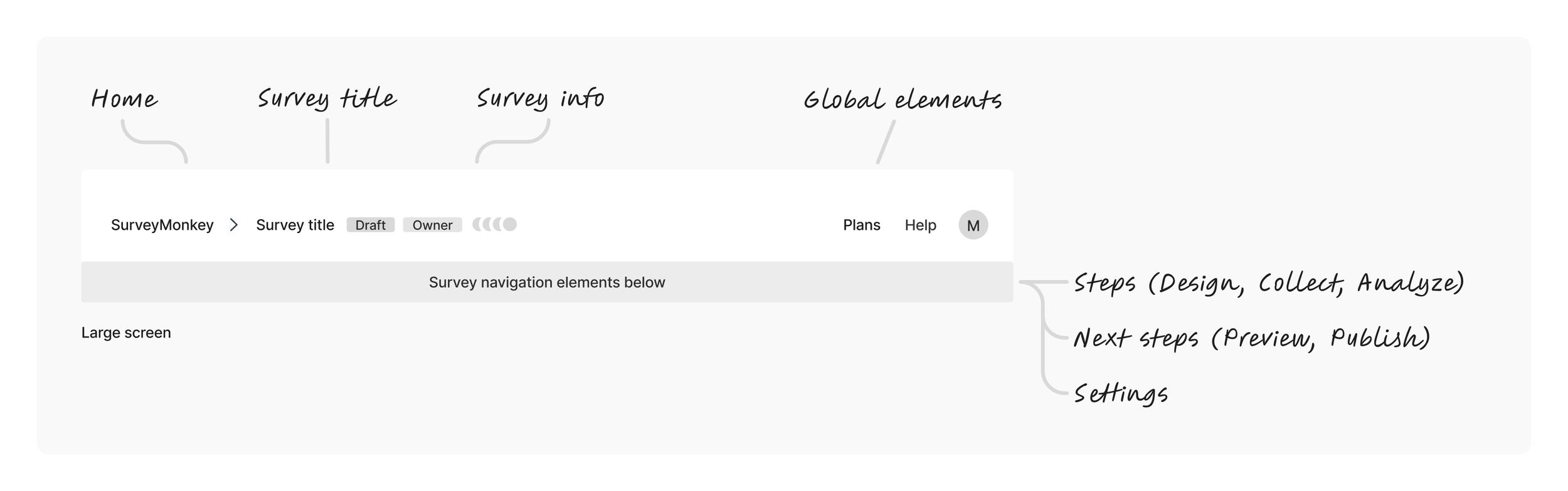
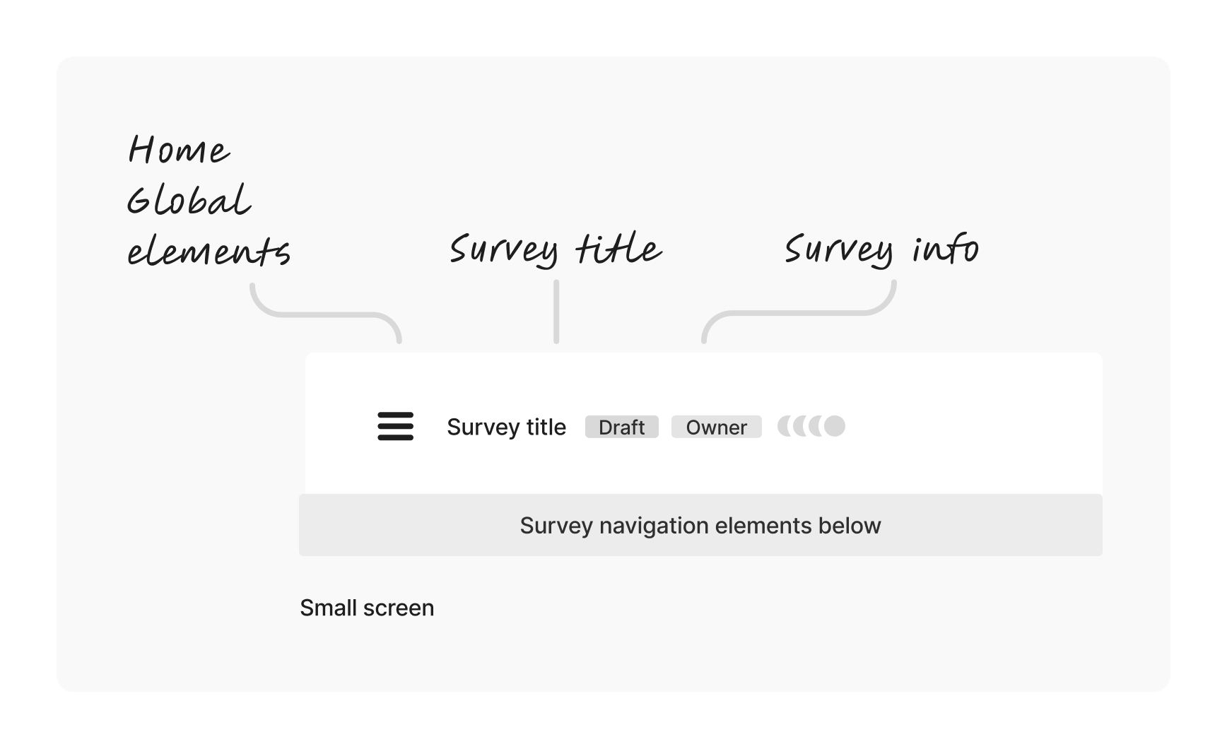
Concept 1. Minimize global (account-level) elements. Use the top area to emphasize the survey title and add breadcrumbs to strengthen wayfinding. On smaller screens, global elements are wrapped in a hamburger menu.
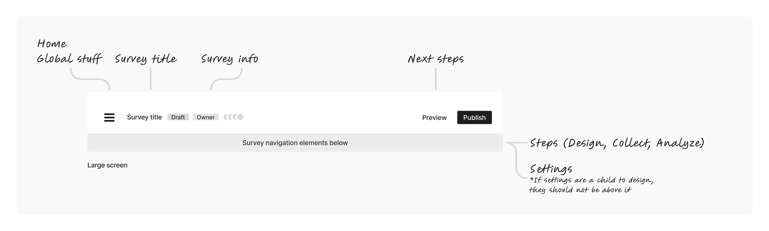
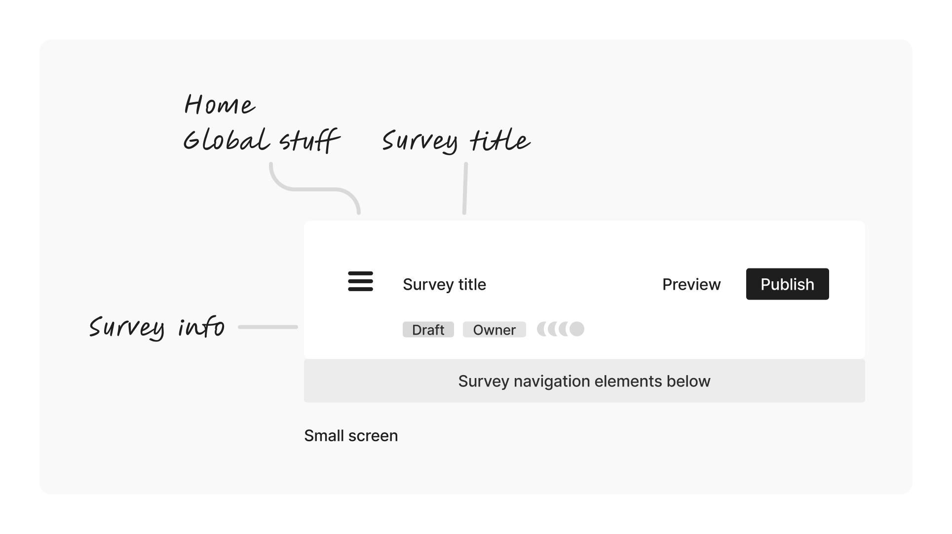
Concept 2. Wrap global (account-level) elements under a hamburger menu on large and small screens. Use the top area to emphasize the survey title and the survey launch action
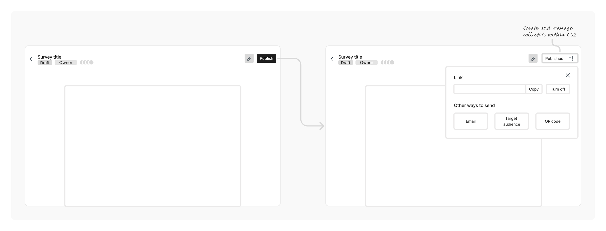
Concept 3. Allow users to publish their survey and grab the link from the editing space. Users currently need to navigate to a different page complete these actions
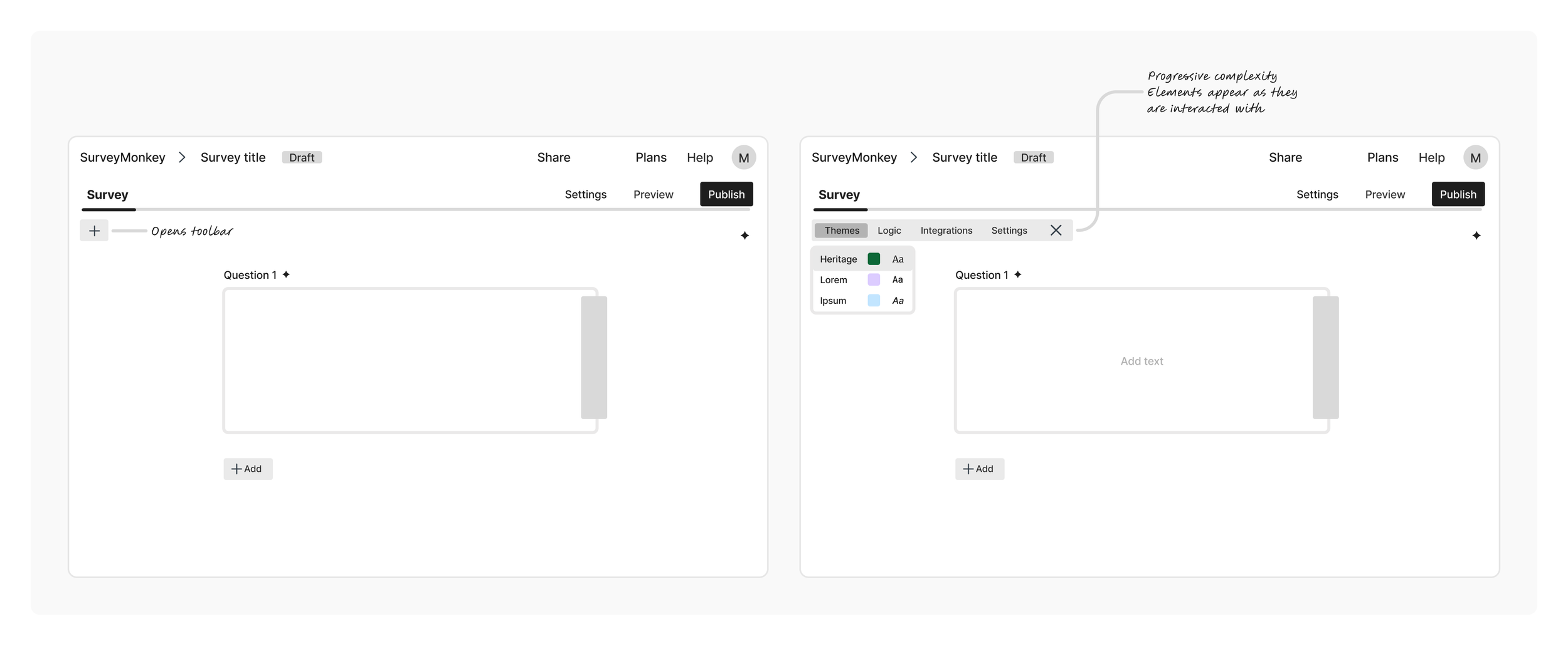
Concept 4. Reduce the UI by simplifying the header and collapsing and expanding the toolbar. The main focus was on adding and editing questions. Theming, logic and other settings were still accessible, one click away.
SOLUTION
A modern header with a clear CTA
The solution combined the best aspects of the concepts:
Modern visual presentation
Respecting users’ definition of modern, the design removed noise and clutter. The light background balanced the header weight with its relevance to survey creation. The reduced height increased the real estate available for the most important part of the UI: the survey.
Clear hierarchy and information architecture
The button clutter was replaced by a primary CTA, removing friction at the exact point where users were ready to act. The new terminology proposed was aligned with users’ mental model (revealed by the co-design research).
Improved wayfinding
Instead of distracting actions that took users away from the survey creation flow, the new header emphasized the survey title, status and contextual actions. The reduced number of steps and the consistent background helped users quickly identify the step in the flow they were on.
Before and after. The new design improved the visual presentation, clarified the information hierarchy, and help users orient themselves.
REFINEMENTS
The publishing flow
Motion and onboarding
The publish action required some motion to help users understand that the triggered action took effect. The button included a spinner to show that the process was in progress. After a successful launch, the survey status would change from draft to open, and the button would change state.
A prototype helped communicate how all the pieces worked together, including the onboarding pieces introducing the changes to current users.
Prototype. The prototype brought the flow together including motion, onboarding and button variations.
Button states and rules
After the user published a survey, the button changed to a state that allowed copying a link with one click while offering options to edit link settings or view other collectors. Even though the focus was on the link creation flow, which covered more than 80% of our users, we also had to consider multiple collectors’ use cases.
Button states after publishing. Even though the link collector was the main focus, the design had to consider multiple collectors’ cases.
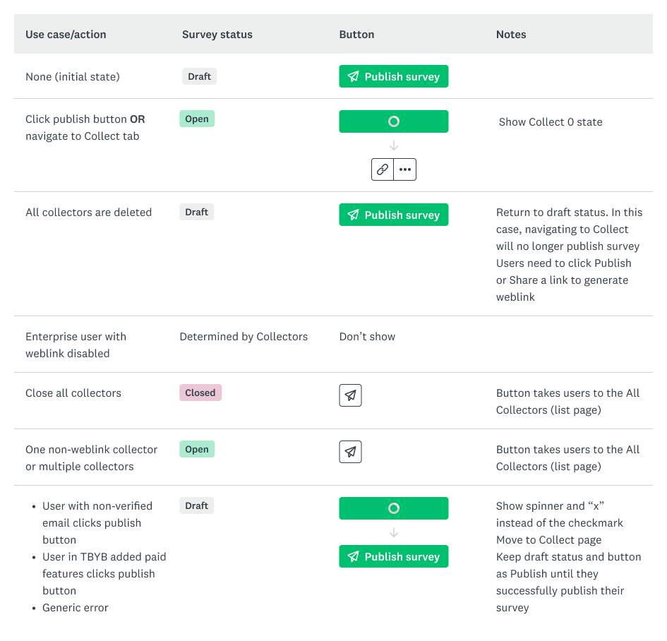
Documentation. A table was created to complement the prototype and clarify the expected behavior for the identified use cases.
LAUNCH
Successful release, on time
The new header was released after 1 quarter of development. The promotional campaigns highlighted the modern look and feel, the ease of launch and the powerful comparison between before and after.
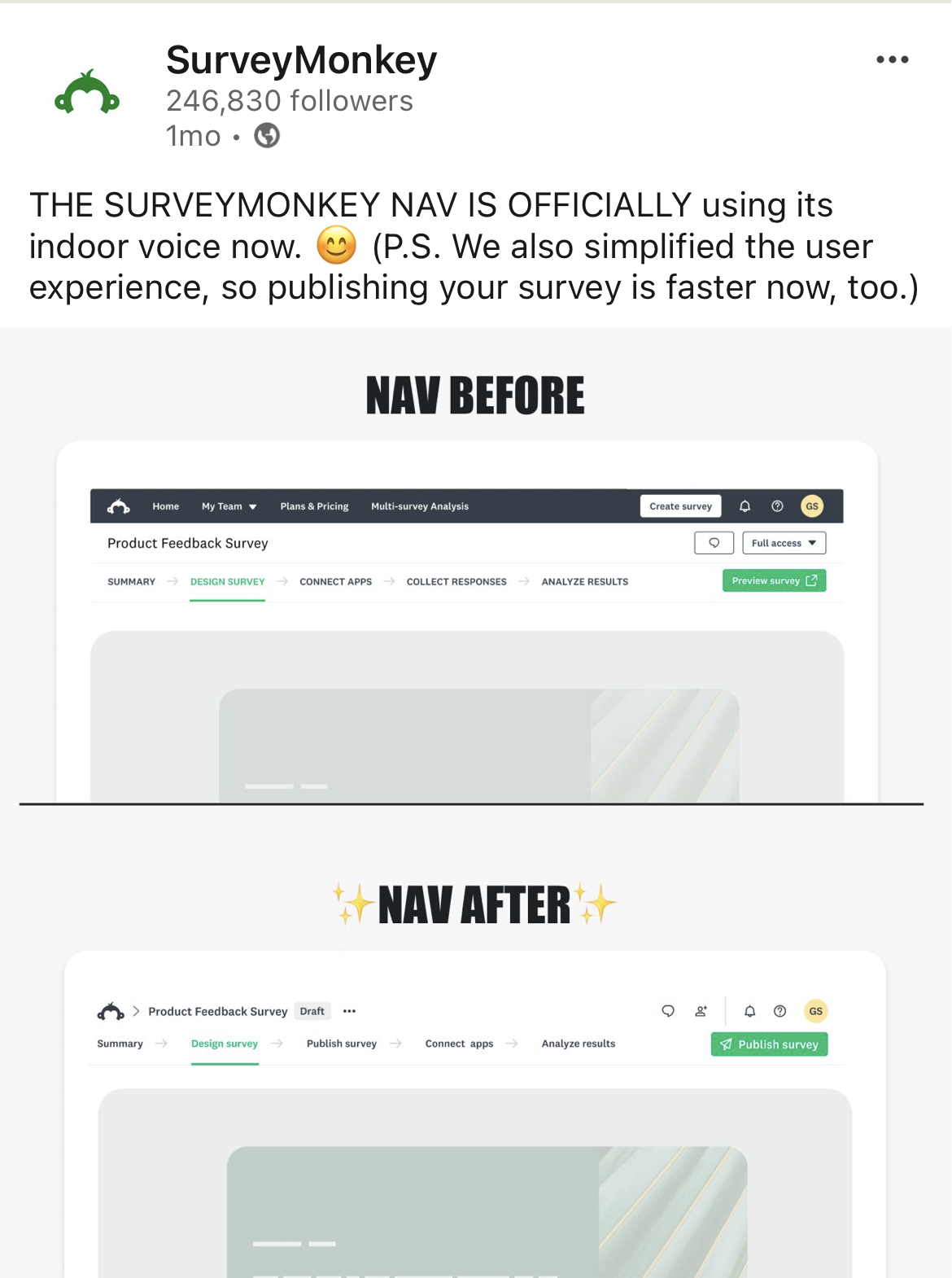
Launch campaign. The promotional materials highlighted the new look and feel by comparing before and after.
Final implementation. The new header visuals and the publishing flow added significant value to the product in a very short period of time. The flickering on load and the abrupt landing on the “publish” page (after hitting the Publish button) were trade-offs we had to make for launch and should be fixed next.
IMPACT
2x more deploys
So far, the simplification work has paid off. The new navigation drove a 2x increase in the deploy rate. The team is observing user behavior and feedback as traffic to the experience increases. We expect to turn on the new navigation for 100% of users by the end of March 2026.
After
10.4%
Before
5.7%
Deploy rate. Before and after the new nav.
Keys to success
Bring the team along
Delivering such a great impact and speed required commitment from the team. This was only possible because design, engineering, and product were involved since the beginning of the project. Ownership and decisions were shared equally across team members. An in-person session halfway through ensured alignment and saved multiple hours of video conference discussions.
Document the journey
Documenting while running against the clock can be challenging. For projects with such breadth, however, it is necessary to keep an organized source of truth for the designs. The very detailed set of specs I created grew as questions arose and decisions were made. If I could do one thing differently, I would have walked the engineers through the specs more frequently and done more quick check-ins.