Survey creation transformation
Driving the redesign of the survey authoring experience
TEAM
Leads
Lead Designer, Lead Product Manager, Lead Researcher, Engineering Manager, Content Designer
5 development pods
Product Designer, Product Manager, Engineer Lead, Engineers
MY CONTRIBUTION AS DESIGN LEAD
Expand the design vision and promote alignment with cross-functional partners and stakeholders
Mentor the 5 designers involved in the project and manage the design work
PROBLEM
Creating a simple survey was challenging
Users complained about 3 main issues:
a.High complexity
Basic and advanced features were displayed to users simultaneously, without a clear hierarchy. The survey, which was usually the primary focus, was sometimes obfuscated by other UI elements.
b.Low efficiency
Completing trivial tasks was very time-consuming. No efficiency tools, such as spellchecking and bulk editing, were available.
c.Unfamiliar interaction patterns
The outdated interface was inconsistent with users’ mental models and expectations. They could not drag and drop answer choices to organize them, for example.
Survey editing. Users complained about the cluttered UI, the lack of efficiency tools, and the unfamiliar interaction patterns
User feedback
“Why can’t I get rid of UI clutter to focus solely on my survey and questions?”
“Why is it so hard to design a basic survey?”
”How come I can’t drag and reorder the response choices below my questions?”
(Source: In-product feedback survey)
RESEARCH
Tasks with low completion and high difficulty rates
A benchmark study revealed that although participants could complete most authoring tasks successfully, simple tasks such as adding a new page or changing the background color had the lowest completion rates – 33.3%.
In a separate survey, participants were asked to rate the difficulty of survey-building tasks from 1 to 5, where 1 was the easiest and 5 was the most difficult. Applying logic and styling were considered the most difficult tasks, with 2.49 and 2.23 points, respectively.
User research, including a benchmark study and a survey, identified 4 tasks as most challenging to users: style a survey, apply logic, change background color, and add page or page break
GOAL
Empower novice and experienced users to create surveys
The goals of the project were to allow:
Novice users (or users with simple use cases) to quickly add questions and style their surveys with an intuitive WYSIWYG interface and built-in efficiencies
Experienced users (or users with sophisticated use cases) to discover and access all the advanced tools they need to program their surveys
Success indicators
A successful redesign should have a measurable positive impact on business and product metrics.
Increase engagement, deploys, and conversion
LEADERSHIP
Breaking down the project into jobs-to-be-done
The general strategy was to break down the project into smaller portions that could be designed and tested simultaneously. These streams were defined based on the survey-building tasks users performed in the tool.
Getting started
Adding questions
Editing questions
Styling
Adding logic
Navigating a survey
Managing the design work
a.Expanding the vision to inform designs and experiments
When I joined the project, an initial vision was already in motion. My main job was to help evolve it based on the research findings and experiment results. As a result, I kept the ideas at a high level, with low-fidelity designs and a story grounded on the principles previously developed by the teams.
Principles
We make every piece with the whole picture in mind
To our users, there is only one product
We start simple and build to complex
We make what’s important for simple use cases more prominent but keep complex stuff available to experts
We build for everybody
We use familiar language and build an accesible experience, offering the right guidance to all experience levels
We create trust. Then we create delight
Users know what to do, how to do it, and enjoy some delightful moments along the way
The principles defined by the team guided the vision and future design decisions
The low fidelity flow connected the 6 project streams and the design principles that anchored the overall design direction
-
1. Getting started
It only took one click to create a survey. Optional starting points, including previously created surveys, appeared in a modal.
We start simple and build to complex
-
2. Adding questions
Users could type in their questions or select a specific element to add. Recent content and AI-generated text emerged as recommendations while they typed.
We create trust. Then we create delight
-
3.Editing questions
The most frequently used actions were readily accessible through the toolbar. Additional settings were available in the ‘More’ menu and the ‘Options panel.
We build for everyone
-
4. Styling
Themes worked globally across the survey, whereas text formatting tools changed the style of specific text strings locally.
We make every piece with the whole picture in mind
-
5. Adding logic
Logic rules were added from the app or the question toolbar. Questions with rules applied to them displayed a logic indicator for easy recognition.
We start simple and build to complex
-
6. Navigating the survey
The overview panel provided a survey bird’s eye view. Users could jump to specific questions by searching or filtering. Indicators allowed easy access to logic rules and comments.
We make every piece with the whole picture in mind
b.Identifying overlaps and opportunities for collaboration
I led weekly team meetings to discuss project status, blockers, and early ideas. On these occasions, we checked the designs for alignment with the vision and identified opportunities for collaboration.
The team syncs uncovered overlaps between projects and opportunities for collaboration. In this board, designers compared 3 distinct panels and identified areas for convegence.
c.Extending discussions beyond the authoring team
I also promoted conversations with leaders of other areas. These discussions revealed opportunities to drive consistency further.
For example, the panel explorations that started within the authoring team expanded to include integrations and data filters. The effort became a formal initiative led by me to unify rule creation flows across the product.
The authoring team's consistency efforts reached areas beyond the authoring experience. The cross-product initiative resulted in a unified design pattern for rule creation flows.
DESIGN
Balancing long-term goals with short-term wins
The product’s core functionality redesign required a system approach with many iterations and rounds of research. While that would take years, experiments and small improvements were developed to validate the overall direction and promote quick wins.
The question editor journey
The question editing stream required multiple explorations of interaction patterns, including question states, toolbars, menus and panels. From low-fidelity sketches to mid-fidelity prototypes, the goal was to build confidence in the general framework and mitigate the risks of changing the product core.
My investigation started with the multiple choice question. Once the framework was validated with this medium-complexity use case, the team could extend the designs to the other question types. The design team would work a few sprints ahead of the implementation.
Initial low-fidelity sketches explored question editing tasks and identified the UI elements to be explored further (question states, toolbars, menus, panels).
User testing
We started testing concepts from the most general to the most specific design decisions. First, we collected feedback on menus and actions. Then, we tested different approaches to hover states and question-level actions. Lastly, we experimented with question-level and text formatting toolbars.
Hover states
We tested 2 diverging concepts for the hover states. Between a flat hover state without any actions available and a granular access to question elements and a toolbar, users responded overwhelmingly in favor of the second. They wanted to be able to access question actions or select a question element right away. Being required to click the question first was considered an unnecessary extra step.
Variant 1. A simple hover state highlighted the question. No actions were visible at that time.
Variant 2. A multi-level hover state highlighted each element of the question. Question-level actions were also displayed.
Toolbars
2 potential alternatives to display question actions and text formatting options were presented to participants. On the first variant, a single toolbar remained static at the top of the question. The text formatting and the question action toolbars were distinct on the second variant. Users responded more positively to variant 2. They wanted the formatting toolbar close to the area they were focusing on, instead of moving their cursor between the top area and the text field to format the text.
Variant 1. The text formatting options were added to the question toolbar, which spanned across the full question width. This version of the toolbar remained static at the top as users selected different text inputs.
Variant 2. The text formatting and the question toolbars were distinct. While the question toolbar appeared at the top of the question when it became active, the text formatting toolbar appeared directly above the active text field.
Next
The next rounds of tests will explore more specialized features such as piping and carryover responses, and AI capabilities.
The quick experiments
The new question editor could only be launched in the product once we had implemented most of the question types. To counterbalance the investment in long transformation projects, we identified opportunities to impact the experience with low-effort experiments,
a.Visual updates increased deploys by 4%
The outdated look and feel, and the excess of call-to-action buttons discouraged users from starting their surveys from scratch.
For this experiment, we updated the style of some UI elements and removed non-critical actions. The hypothesis was that by making the UI cleaner and more visually appealing, users would feel more enticed to create their surveys.
The impact was stronger on new users, who deployed 4% more surveys.
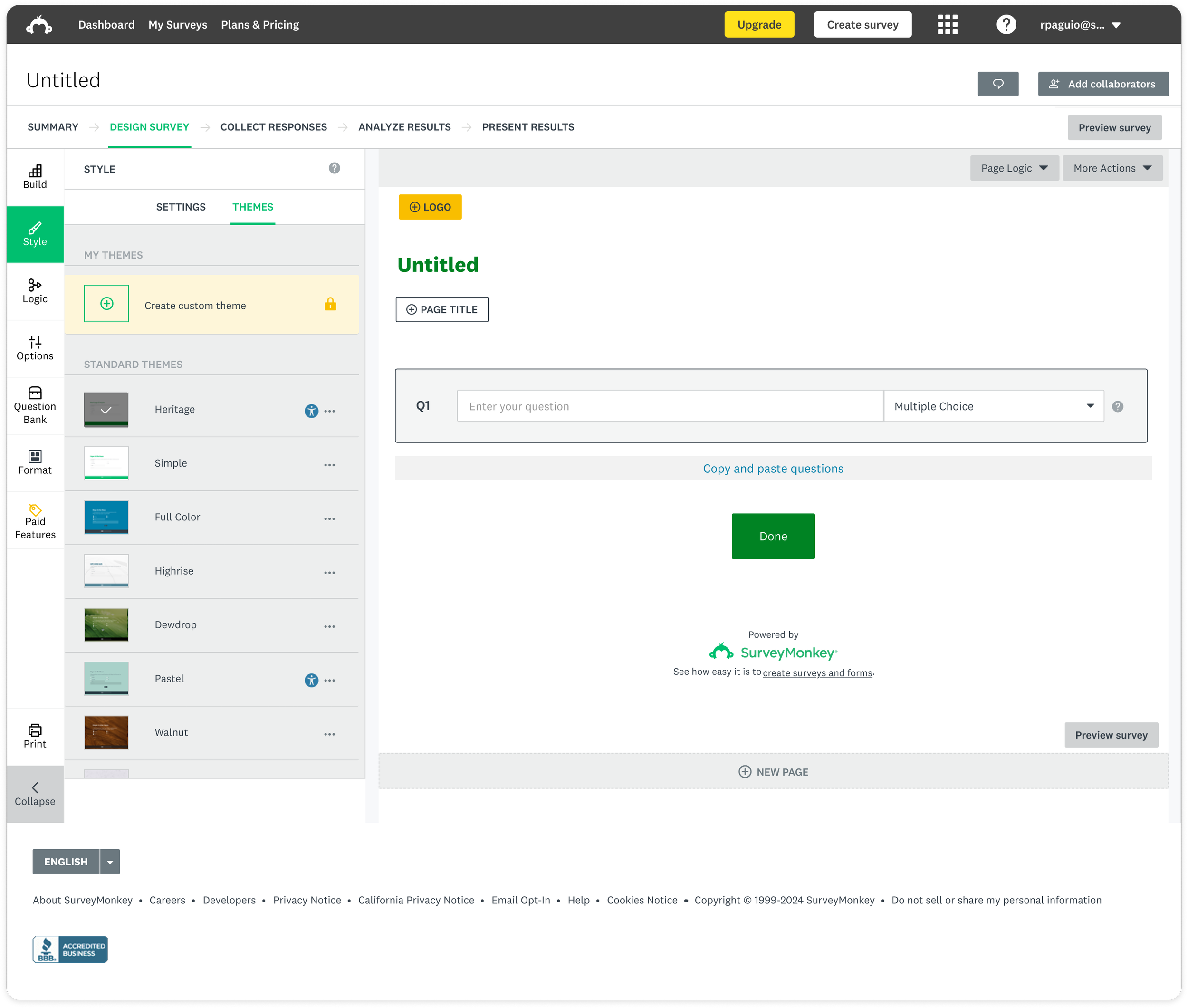
Before. The UI looked dated and busy, with a lot of gray and non-critical actions
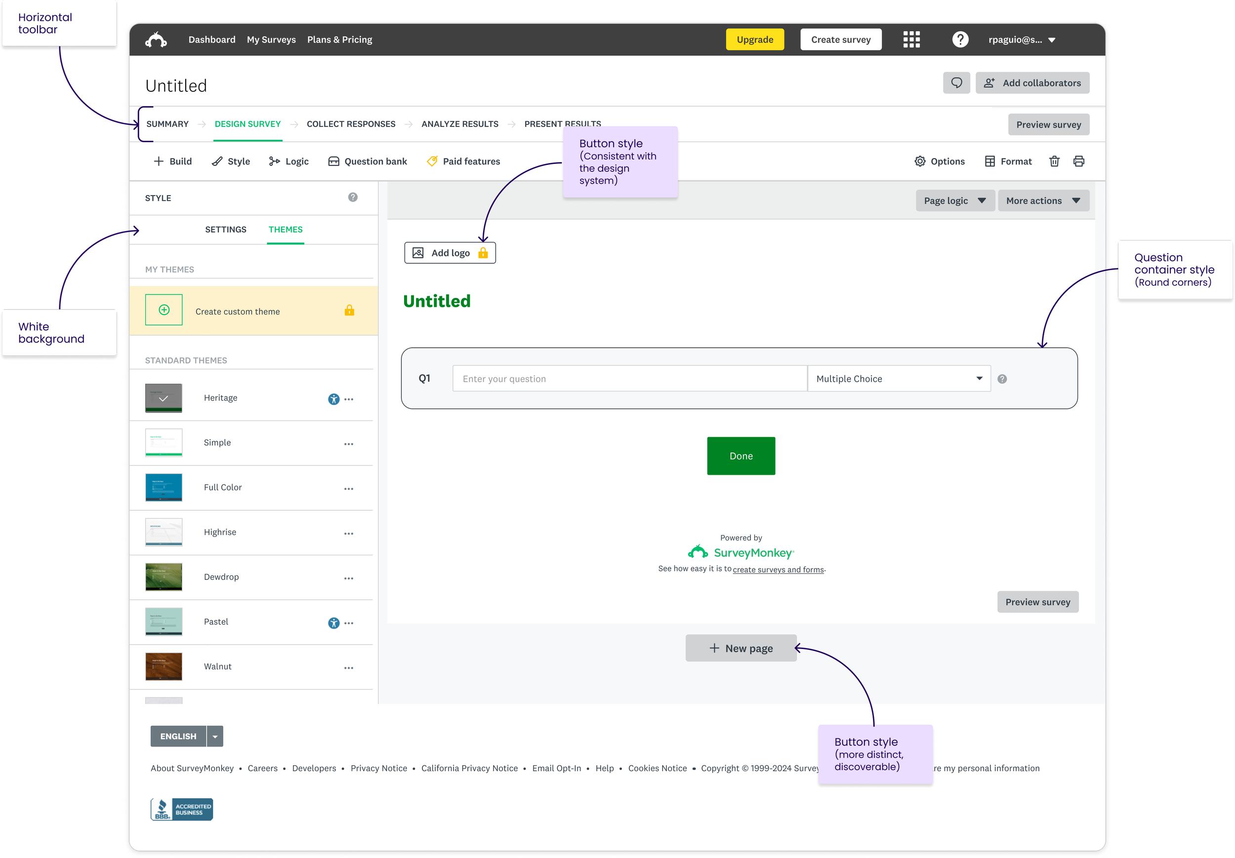
After. Updated button styles, corner radius, and background color. Non-critical actions were removed.
b.Contextual page break option increased usage by 3%
Adding a page break was one of the tasks with the lowest completion rates in the benchmark study.
This experiment added a contextual button between questions to make it easier for users to add a page break.
This increased the feature usage by 3%. The plan is to include the main survey element types in a contextual menu. This may solve some of the current discoverability issues.
Before. Users had to scroll a long list to find the page break.
After. Users can add a page break by hovering between questions.
Future. Users can add the main survey element types through a contextual menu.
The experiment results and learnings have been informing the vision work as well. We intend to continue balancing long and short term improvements until the launch.
Keys to success
Communication holds teams together
Since multiple teams were involved in this project, a strong communication strategy was fundamental to ensure information flowed efficiently.
Recurring meetings with the cross-functional leads, the design team, and design leads from other areas were critical to share the knowledge top-down (from the project leads to the design team), bottom-up (from the design team to project leads) and horizontally (between different project leads).
Visuals are worth 1,000 words
To complement the verbal communication, I developed visual artifacts to help set the focus of the discussions. This was particularly valuable for cross-disciplinary collaboration, where participants didn’t often share the same vocabulary.
Low-fidelity sketches, wireframes, and diagrams were added to the project documentation to be referenced in future discussions.
I also created a visual roadmap: a modular system for designers to drop their up-to-date work as components. I assembled the components into consistent screens and regularly produced snapshots of the state of the work.
Feedback