Notification center design
Improving the in-product notification experience
TEAM
2 Product Designers, 1 Content Designer, 1 Product Manager, 1 Engineering Manager, 3 Engineers
Problem definition and research support
Wireframes, flows, and mid-fidelity specs, and guidance on final visual specs
General guidelines for in-product messaging
MY CONTRIBUTION AS DESIGN LEAD
PROBLEM
Low value, high disruption
The messages we delivered in our product competed for the users’ attention, causing distractions and interrupting ongoing tasks.
The initial research revealed 3 main pain points to the product notifications:
a. Low value
The most prominent messages were not the ones considered most valuable by users.
The team interviewed 11 users and surveyed 112 customers to understand general needs, pain points, preferred subjects, and channels.
The findings indicated that people expect notifications to help them complete tasks, save time or money. Messages that asked for information were received with skepticism.
Subjects considered most valuable by respondents were either not delivered in the product or appeared sparingly at the discretion of individual teams.
“You are collecting information instead of helping me”
– Interviewee
b. Intrusiveness
Even valuable notifications became irrelevant when they had no connection with the ongoing task.
c. Inconsistency
Similar messages were pushed to users inconsistently, with different presentations and behavior.
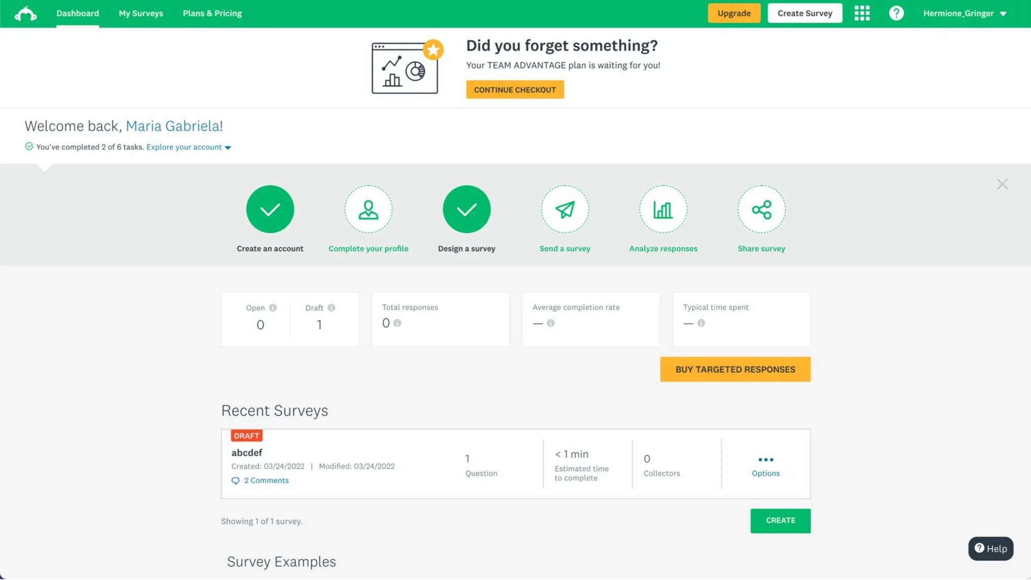
At the top of the screen, promotional and onboarding messages took up space and pushed user-generated content below the visible area.
An invite for personalization popped up as a modal, interrupting ongoing tasks.
GOAL
Aligning prominence with value
The project intended to improve the in-app notification experience, ensuring messages were displayed at the right time through appropriate channels. This included:
Reducing interruptions and aligning message prominence with its relevance to users
Providing a centralized space for users to access their most valuable notifications and defining which messages should be displayed there
Success indicators
Healthy interaction with productivity-related notifications
Decreased utilization of intrusive messaging methods for non-urgent subjects
DESIGN
The journey map revealed the message types users encountered through the product
The design phase started with a journey map exercise with cross-functional partners. The team uncovered common message types and opportunities to communicate with users when they most need it.
The exercise inspired three design principles that guided the envisioning.
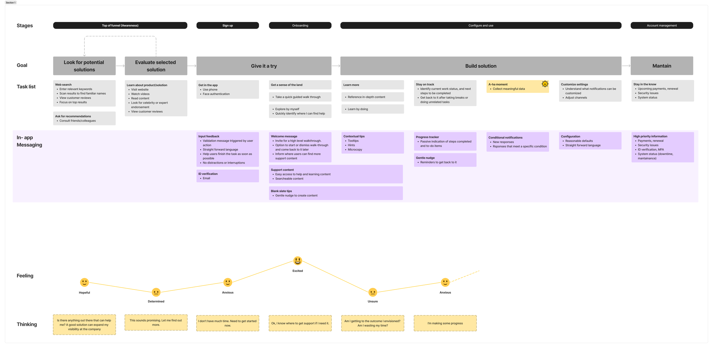
The journey map revealed the message types users encountered from signup until after they deployed a survey.
Steps in which users felt anxious or unsure were identified as opportunities to help them overcome the obstacles and complete their tasks.
Principles
Prioritize efficiency
Respect my time and pace
Give me reasonable defaults
Allow me to change settings if I need to
Keep support content at hand
I’ll come back to it when I need it
The design principles pioritized efficiency, configurability, and self-serve support content.
Vision
I developed a vision for a respectful and configurable messaging system based on the principles and the identified opportunities. The flow was presented to the team through low-fidelity wireframes.
The vision included onboarding messages, reminders, and notifications about new responses, comments or critical events.
Framework
I drove the initiative to develop a decision framework to help teams deliver messages through the right channels.
The framework recommended specific design system components based on the nature of the message, its context and level of urgency.
The diagram suggested using the notification center to inform users of events related to their surveys, the messages considered most valuable to them according to the user interviews and surveys conducted.
The notification framework helped teams decide if their messages belonged in the notification center.
Notification center
The design work for the notifications center involved defining a mechanism to open a side panel, exploring the visual presentation of the messages, and aligning on the functionality that would initially be available.
As exemplified in the vision, we decided to surface some messages already delivered by email. The idea was to offer more ways for users to find out about relevant events in the app.
Bell icon added to the global header
Explorations on bell icon modifiers
Explorations on the panel visual presentation, message states, and actions available
A zero state added some visual interest and set expectations on what types of notifications would be displayed in the panel.
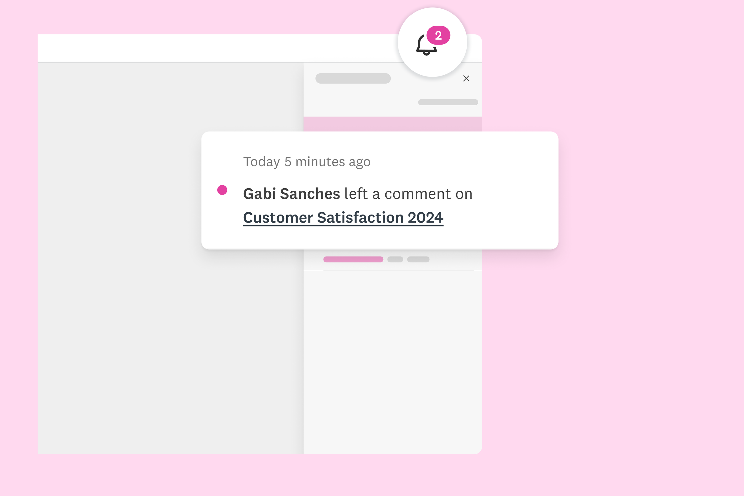
The notification panel displayed notifications about new responses and comments. Unread messages were highlighted with a modifier and a bold typographic treatment. Links took users to the corresponding survey.
RESULTS
Less disruption, more productivity
20+ notification types have been adapted from email to the in-product format
Teams have applied the framework to their decision-making process and reported that it helped them make more intentional decisions
There has been a significant reduction of usage of modals to display trivial messages
Good design looks simple but takes a lot of work
-
11
Customer interviews
-
112
Survey responses
-
1
Journey map
-
5
Iterations on the framework
-
14+
Use cases evaluated
-
28
Email notification mapped
KEYS TO SUCCESS
Think big, start small
Expanding the scope of the discovery phase proved to be a good decision. The notification center would only be valuable to our customers if its messages were helpful and consistent. It was necessary to determine where each notification belonged depending on its subject, urgency, and context.
Better together
For the guidance piece, we were able to combine the efforts of three teams: Content Design, Design System, and Product Design. We realized the close connection between notifications and components used to deliver them, offered an opportunity for us to develop the guidelines together.
Feedback